Dataset
As shown before, we use two datasets from Yelp. In this section we perform analysis on business.json dataset. The review.json dataset is analysed and modeled in NLP section. Business dataset contains attributes like:
- Unique business ID
- Name and full address
- Map coordinates
- star ratings and review counts
- Business facilities
- Business categories
Preprocessing
We perform data wrangling where we remove unwanted columns and null values.
business <- stream_in(file('yelp_academic_dataset_business.json'))
business_df <- as_data_frame(flatten(business))
restaurant_df <- business_df %>% filter(str_detect(categories, "Restaurants"))

colSums(is.na(restaurant_df))

### Dropping of columns where the ratio of NA values is more than 80% of the total data for that column ###
rest_df <- restaurant_df[, which(colMeans(!is.na(restaurant_df)) > 0.80)]
colSums(is.na(rest_df))

### Further dropping uncessary columns ###
rest_df <- rest_df[-c(11,13,14,17,18)]

#colnames(rest_df)

### Renaming of the columns for better readbility ###
rest_df <- rest_df %>% rename(Price_range = attributes.RestaurantsPriceRange2)
rest_df <- rest_df %>% rename(Restaurant_takeout = attributes.RestaurantsTakeOut)
rest_df <- rest_df %>% rename(Restaurant_delivery = attributes.RestaurantsDelivery)
rest_df <- rest_df %>% rename(Outdoor_seating = attributes.OutdoorSeating)
We then assign human-friendly values to the facilities provided by these businesses for better readability in the map.
rest_df$Price_range[is.na(rest_df$Price_range)] <- 'Not Available'
rest_df$Price_range <- str_replace_all(rest_df$Price_range, "None", "Not Available")

rest_df$Restaurant_takeout[is.na(rest_df$Restaurant_takeout)] <- 0
rest_df$Restaurant_delivery[is.na(rest_df$Restaurant_delivery)] <- 0
rest_df$Outdoor_seating[is.na(rest_df$Outdoor_seating)] <- 0

rest_df$Restaurant_takeout <- ifelse(grepl('True', rest_df$Restaurant_takeout, ignore.case = F), 'Yes',
                                     ifelse(grepl('False',rest_df$Restaurant_takeout, ignore.case = F), 'No',
                                            ifelse(grepl('None',rest_df$Restaurant_takeout, ignore.case = F), 'No',
                                                   'Not Available')))

rest_df$Restaurant_delivery <- ifelse(grepl('True', rest_df$Restaurant_delivery, ignore.case = F), 'Yes',
                                      ifelse(grepl('False',rest_df$Restaurant_delivery, ignore.case = F), 'No',
                                             ifelse(grepl('None',rest_df$Restaurant_delivery, ignore.case = F), 'No',
                                                    'Not Available')))

rest_df$Outdoor_seating <- ifelse(grepl('True', rest_df$Outdoor_seating, ignore.case = F), 'Yes',
                                  ifelse(grepl('False',rest_df$Outdoor_seating, ignore.case = F), 'No',
                                         ifelse(grepl('None',rest_df$Outdoor_seating, ignore.case = F), 'No',
                                                'Not Available')))
Selecting business categories
As shown here. There are alot of categories in Food/ Restarant business types on Yelp. Based on our analysis, we found some of the categories to overlap with each other and some not having sufficient businesses in that category. So we created our custom list of categories after analysis where we merge a few overlapping categories (e.g. FastFood, Burgers, Steak all merged in American or sportsbar, nightlife merged into Pub category). This creates a clean dataset with sufficient business frequency in each category.
### Categories list ###
categories <- restaurant_df %>% mutate(categories = as.character(categories)) %>% select(categories)
### Assigning the respective sub-categories for the Restaurants ####
categories$`Sub_category` <- ifelse(grepl("american",categories$categories, ignore.case = T),"American",
ifelse(grepl("burgers",categories$categories, ignore.case = T),"American",
ifelse(grepl("food",categories$categories, ignore.case = T),"American",
ifelse(grepl("Cheesesteaks",categories$categories, ignore.case = T),"American",
ifelse(grepl("American (Traditional)",categories$categories, ignore.case = T),"American",
ifelse(grepl("American (New)",categories$categories, ignore.case = T),"American",
ifelse(grepl("Steakhouses",categories$categories, ignore.case = T),"American",
ifelse(grepl("Breakfast & Brunch",categories$categories, ignore.case = T),"American",
ifelse(grepl("Sandwiches",categories$categories, ignore.case = T),"American",
ifelse(grepl("african",categories$categories, ignore.case = T),"African",
ifelse(grepl("asian",categories$categories, ignore.case = T),"Asian",
ifelse(grepl("asian fusion",categories$categories, ignore.case = T),"Asian",
ifelse(grepl("argentine",categories$categories, ignore.case = T),"Argentine",
ifelse(grepl("Middle East" ,categories$categories, ignore.case = T),"Arabic",
ifelse(grepl("bakeries",categories$categories, ignore.case = T),"Bakery",
ifelse(grepl("delis",categories$categories, ignore.case = T),"Bakery",
ifelse(grepl("Coffee & Tea",categories$categories, ignore.case = T),"Bakery",
ifelse(grepl("bars",categories$categories, ignore.case = T),"Pub",
ifelse(grepl("Pub",categories$categories, ignore.case = T),"Pub",
ifelse(grepl("sport bar",categories$categories, ignore.case = T),"Pub",
ifelse(grepl("nightlife",categories$categories, ignore.case = T),"Pub",
ifelse(grepl("clubs",categories$categories, ignore.case = T),"Pub",
ifelse(grepl("buffets",categories$categories, ignore.case = T),"Buffet",
ifelse(grepl("Chinese",categories$categories, ignore.case = T),"Chinese",
ifelse(grepl("sushi bars",categories$categories, ignore.case = T),"Chinese",
ifelse(grepl("dumplings",categories$categories, ignore.case = T),"Chinese",
ifelse(grepl("cafes",categories$categories, ignore.case = T),"Cafes",
ifelse(grepl("Cajun",categories$categories, ignore.case = T),"Cajun",
ifelse(grepl("Donuts",categories$categories, ignore.case = T),"Donuts",
ifelse(grepl("french",categories$categories, ignore.case = T),"French",
ifelse(grepl("filipino",categories$categories, ignore.case = T),"Filipino",
ifelse(grepl("greek",categories$categories, ignore.case = T),"Greek",
ifelse(grepl("lebanese",categories$categories, ignore.case = T),"Lebanese",
ifelse(grepl("Desserts",categories$categories, ignore.case = T),"Ice-cream Parlor",
ifelse(grepl("indian",categories$categories, ignore.case = T),"Indian",
ifelse(grepl("italian",categories$categories, ignore.case = T),"Italian",
ifelse(grepl("juice bars & smoothies",categories$categories, ignore.case = T),"Juice-Bar",
ifelse(grepl("korean",categories$categories, ignore.case = T),"Korean",
ifelse(grepl("mexican",categories$categories, ignore.case = T),"Mexican",
ifelse(grepl("polish",categories$categories, ignore.case = T),"Polish",
ifelse(grepl("Peruvian",categories$categories, ignore.case = T),"Peruvian",
ifelse(grepl("Afghan",categories$categories, ignore.case = T),"Afghan",
ifelse(grepl("pizza",categories$categories, ignore.case = T),"Pizza",
ifelse(grepl("russian",categories$categories, ignore.case = T),"Russian",
ifelse(grepl("japanese",categories$categories, ignore.case = T),"Japanese",
ifelse(grepl("seafood",categories$categories, ignore.case = T),"Seafood",
ifelse(grepl("caribbean",categories$categories, ignore.case = T),"Seafood",
ifelse(grepl("thai",categories$categories, ignore.case = T),"Thai",
ifelse(grepl("vietnamese",categories$categories, ignore.case = T),"Vietnamese",
"American")))))))))))))))))))))))))))))))))))))))))))))))))
### Combining the sub-category to the original data frame ###
rest_df <- cbind(rest_df,categories)
### Dropping the unnecessary columns from the data frame ###
final_df <- rest_df[-c(11,16)]
State selection for GUI
Due to the large size of dataset, it becomes infeasible to select the businesses from all the cities of their respective states. It puts constraints on the current system resources to process and extract information from this dataset. Additionally, the shiny GUI, uploaded online has computational and storage restrictions. Therefore, we decided to use two major states of different countries; Arizona (AZ) & Ontario (ON) build a prototype which can be generalized over other part of datasets. Our selection of two cities is based on plots shown below.
Cleanup of city names
az_df <- final_df[final_df[,'state'] == 'AZ',]

on_df <- final_df[final_df[,'state'] == 'ON',]

az_df$city <- tolower(az_df$city)

az_df$city = str_replace(az_df$city,"pheonix","phoenix")
az_df$city = str_replace(az_df$city,"phoenix az","phoenix")
az_df$city = str_replace(az_df$city,"phoenix valley","phoenix")
az_df$city = str_replace(az_df$city,"phx","phoenix")

az_df$city = str_replace(az_df$city,"central","phoenix")
az_df$city = str_replace(az_df$city,"phoenix city","phoenix")
az_df$city = str_replace(az_df$city,"phoenix village","phoenix")

az_df$city = str_replace(az_df$city,"mes","mesa")
az_df$city = str_replace(az_df$city,"mesaa","mesa")

az_df$city = str_replace(az_df$city,"gelndale","glendale")
az_df$city = str_replace(az_df$city,"glendale az","glendale")
az_df$city = str_replace(az_df$city,"laveen village","laveen")

az_df$city = str_replace(az_df$city,"schottsdale","scottsdale")
az_df$city = str_replace(az_df$city,"scottdale","scottsdale")

az_df$city <- str_to_title(az_df$city)

on_df$city <- tolower(on_df$city)

on_df$city = str_replace(on_df$city,"caledon east","caledon")
on_df$city = str_replace(on_df$city,"caledon village","caledon")

on_df$city = str_replace(on_df$city,"east gwillimburry","east gwillimbury")

on_df$city = str_replace(on_df$city,"etibicoke","etobicoke")
on_df$city = str_replace(on_df$city,"etobiicoke","etobicoke")

on_df$city = str_replace(on_df$city,"missisauga","mississauga")
on_df$city = str_replace(on_df$city,"mississuaga","mississauga")

on_df$city = str_replace(on_df$city,"oakridges","oak ridges")

on_df$city = str_replace(on_df$city,"oakridges","oak ridges")

on_df$city = str_replace(on_df$city,"north york","north york")

on_df$city = str_replace(on_df$city,"richmond hil","richmond hill")
on_df$city = str_replace(on_df$city,"richmond hilll","richmond hill")

on_df$city = str_replace(on_df$city,"scarobrough","scarborough")

on_df$city = str_replace(on_df$city,"thornhil","thornhill")
on_df$city = str_replace(on_df$city,"thornhilll","thornhill")

on_df$city = str_replace(on_df$city,"tornto","toronto")

on_df$city = str_replace(on_df$city,"whiitby","whitby")
on_df$city = str_replace(on_df$city,"whtiby","whitby")

on_df$city <- str_to_title(on_df$city)
Exploratory Analysis
Restaurant concentration
Here is an interactive plot which shows restaurant concentration for individual cities.
# Graph 3
#-----With legend
#Define color palette
dfForGraph <- dfFOrLeaflet %>%
  group_by(Latitude,Longitude,City,Price_range) %>%
  summarise(count=n())%>% filter(count >20)

pal <- colorNumeric(
  palette = 'RdBu',#"YlGnBu",
  domain = dfForGraph$count
)
# Create Map
map<-leaflet(dfForGraph) %>% addTiles() %>% setView(lng = -111.92556,
                                                    lat = 33.56518, zoom = 12) %>%
  addCircles(lng = ~Longitude, lat = ~Latitude, weight = 1, color = ~pal(count),
             radius = ~sqrt(count) * 30, popup = ~City
  )
#Add legend
map %>%
  addLegend("bottomright", pal = pal, values = ~dfForGraph$count,
            title = "Count of Restaurants",
            opacity = 1)
State-wise distribution of restaurants
ggplot(data = as.data.frame(table(final_df$state)) ,
       aes(x = reorder(Var1, -Freq), y = Freq, label = paste0(Freq))) +
  geom_segment(aes(x = reorder(Var1, -Freq) ,xend=Var1, y=0, yend=Freq), color = 'black') +
  geom_point(size=13, color= 'maroon') +
  geom_text(color = "white", size = 4) +
  labs(x ="States", y= "No. of Restaurants", title = "States and No. of Restaurants") +
  theme(plot.title = element_text(hjust = 0.5), plot.subtitle = element_text(hjust = 0.5),
        axis.text.x = element_text(angle = 45, hjust = 1)) +
  scale_x_discrete(breaks=c("ON","AZ","NV","QC","OH","NC","PA","AB","WI","IL","AR","AL","BC","CA",
                            "CO","FL","HI","HPL","MB","NE","NY","OR","SC","TX","VA","VT","WA","XWY"),
                   labels= c("Ontario", "Arizona", "Nevada","Quebec","Ohio","North Carolina",
                             "Pennslyvania","Alberta","Wisconsin","Illinois","Arkansas","Alabama","British Columbia",
                             "California","Colorado","Florida","Hawaii","Hartlepool","Manitoba",
                             "Nebraska","New York","Oregon","South Carolina","Texas","Virginia",
                             "Vermont","Washington","Leeds"))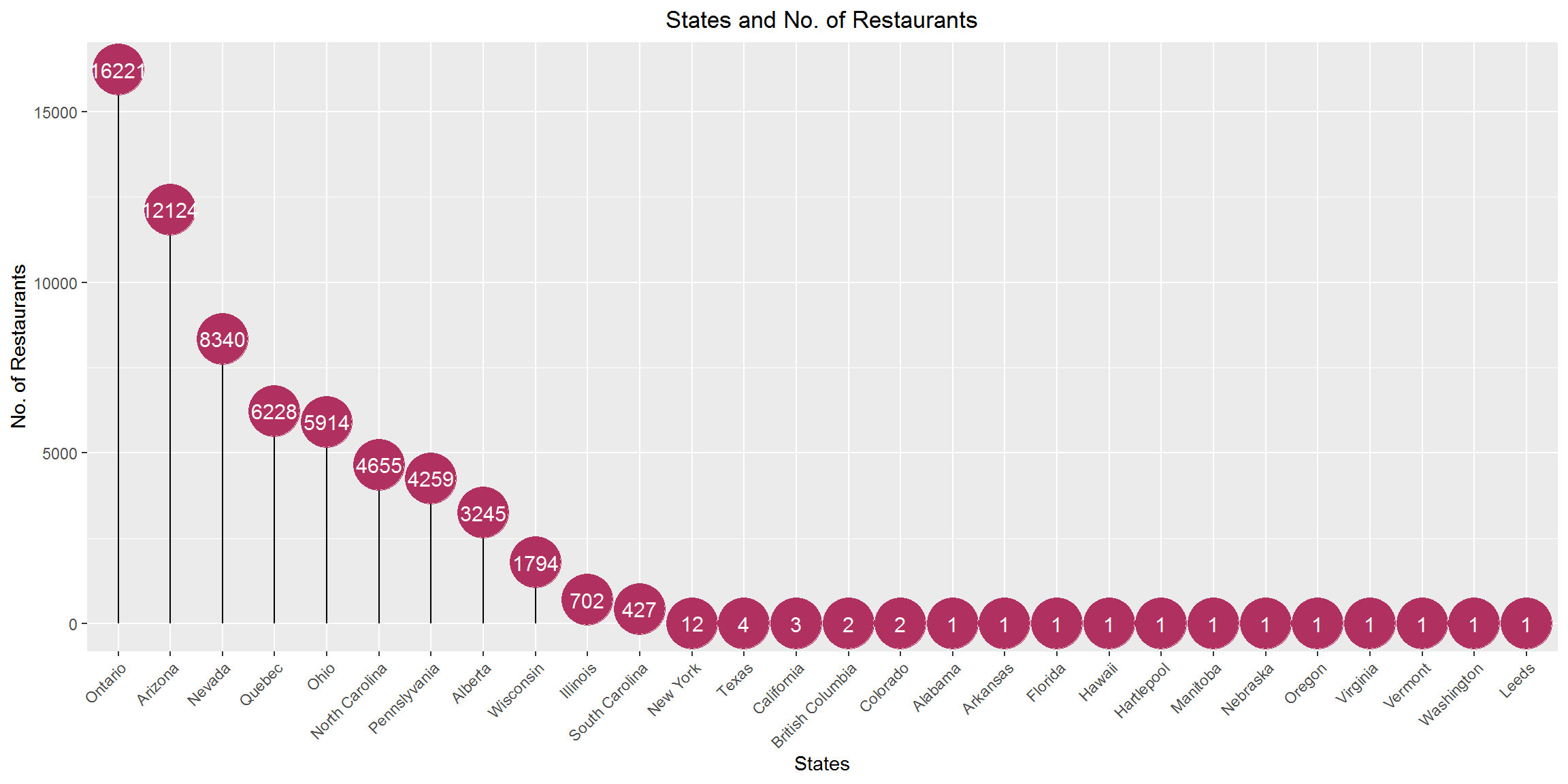
The top two states with respect to the number of restaurant establishments are Ontario and Arizona and thus had been selected for the implementation.
Restaurant price per person distribution across states
temp_final <- final_df[c(5,11)]

temp_final$Price_range <- ifelse(grepl('1', temp_final$Price_range, ignore.case = F), '1',
                                 ifelse(grepl('2',temp_final$Price_range, ignore.case = F), '2',
                                        ifelse(grepl('3',temp_final$Price_range, ignore.case = F), '2',
                                               ifelse(grepl('4',temp_final$Price_range, ignore.case = F), '3',
                                                      ifelse(grepl('Not Available',temp_final$Price_range, ignore.case = F), '0',
                                                             '')))))

data_group_state_price <- temp_final %>%
  filter(state != '') %>% mutate(tsum = n()) %>%
  group_by(state, Price_range)

data_group_state_price$Price_range <- as.numeric(data_group_state_price$Price_range)

data_weighted_group_state_price <- data_group_state_price %>%
  summarise(total_res_price_range = n()) %>% arrange(desc(Price_range)) %>%
  mutate(total_res = sum(total_res_price_range)) %>% mutate(percent = round((total_res_price_range / total_res)*100, 1))

data_weighted_group_state_price$Price_range <- as.integer(data_weighted_group_state_price$Price_range)

ggplot(data_weighted_group_state_price, aes(x = reorder(state,total_res), y = Price_range, label = paste0(percent))) +
  geom_point(aes(size = percent, color = Price_range), alpha= 1) +
  geom_text(hjust = 0.4, size = 4) +
  scale_size(range = c(1, 12), guide= "none") +
  labs(title = "Restaurants Price per person by State ", subtitle = "(All numbers are in percentage)",
       x = "States (ascending order in terms of number of restaurants)",
       y = "Price per Person") +
  theme(plot.title = element_text(hjust = 0.5), plot.subtitle = element_text(hjust = 0.5),
        axis.text.x = element_text(angle = 45, hjust = 1)) +
  scale_color_gradient(name = "Price per Person", breaks= c(0,1,2,3),
                       labels = c("Not Available","Under $10", "$11-60", "Above $60"),
                       guide = "colorbar", low= "yellow", high = "#FF2000") +
  scale_y_continuous(breaks = c(0,1,2,3), labels= c("Not Available","Under $10", "$11-60", "Above $60")) +
  scale_x_discrete(breaks=c("ON","AZ","NV","QC","OH","NC","PA","AB","WI","IL","AR","AL","BC","CA",
                            "CO","FL","HI","HPL","MB","NE","NY","OR","SC","TX","VA","VT","WA","XWY"),
                   labels= c("Ontario", "Arizona", "Nevada","Quebec","Ohio","North Carolina",
                             "Pennslyvania","Alberta","Wisconsin","Illinois","Arkansas","Alabama","British Columbia",
                             "California","Colorado","Florida","Hawaii","Hartlepool","Manitoba",
                             "Nebraska","New York","Oregon","South Carolina","Texas","Virginia",
                             "Vermont","Washington","Leeds"))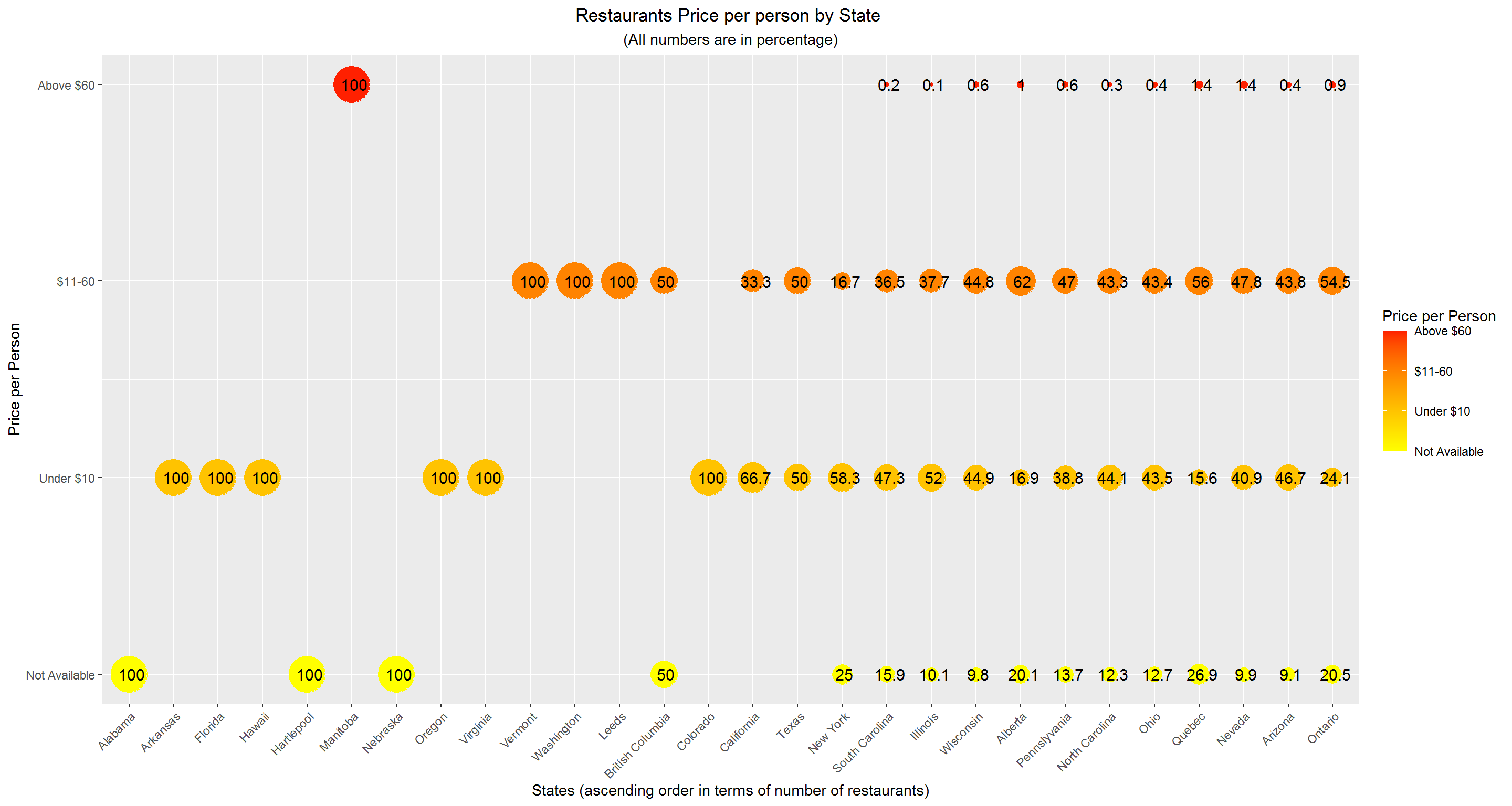
The six states which have the cheapest restaurants, viz. Arkansas, Florida, Hawaii, Oregon, Virginia, Colorado. And the state with most expensive restaurants is Manitoba.
Word cloud (Restaurant type)
pal2 <- brewer.pal(8,"Dark2")
wordcloud(final_df$Sub_category,scale=c(4,.9), min.freq = 25,random.order=FALSE,random.color = TRUE, rot.per=.15, colors=pal2)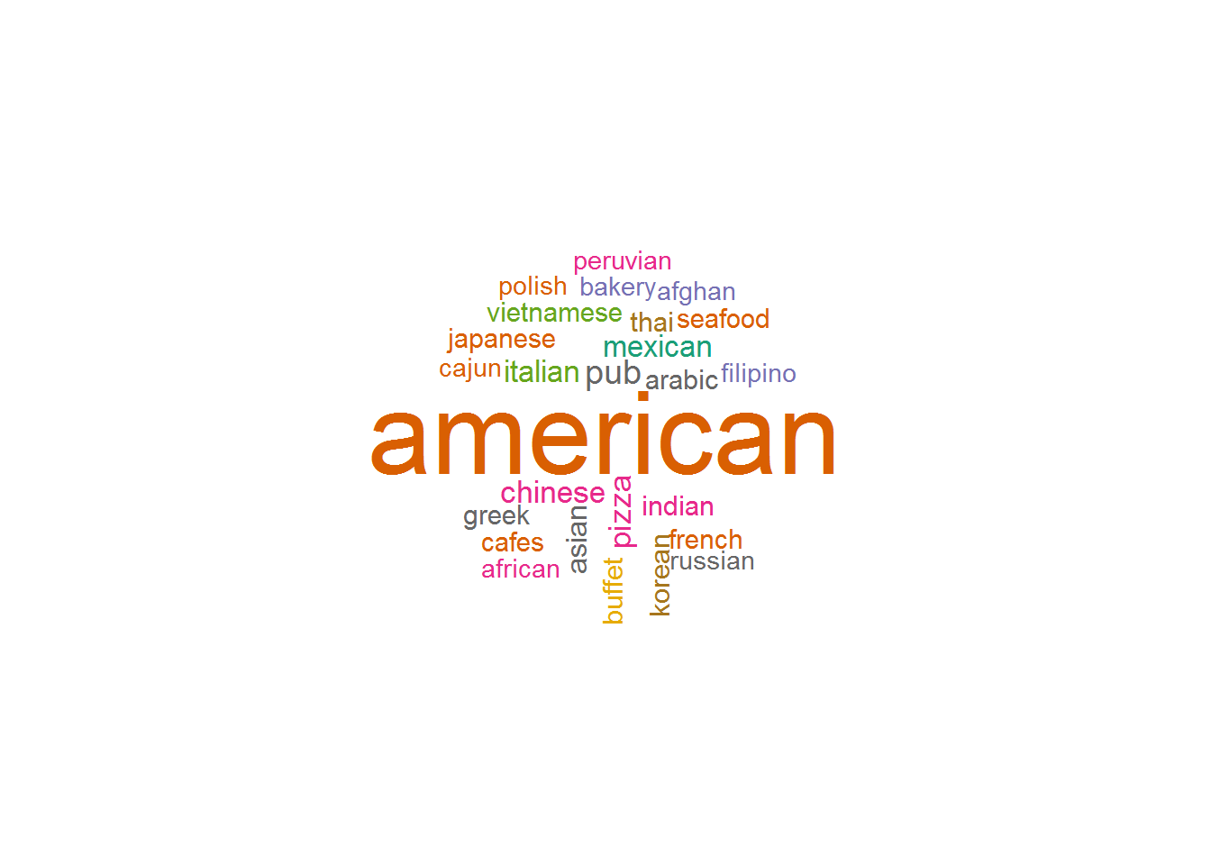
American is the most common restaurant category among entire Yelp dataset (At its current size).
Rating-wise restaurant distribution (AZ and ON)
temp_az_star <- as.data.frame(table(az_df$stars))
temp_on_star <- as.data.frame(table(on_df$stars))

final_temp <- temp_az_star

final_temp['Freq1'] <- vlookup_df(final_temp$Var1, temp_on_star, result_column= 'Freq', lookup_column= 'Var1')

final_temp <- final_temp %>% rename(Arizona = Freq)

final_temp <- final_temp %>% rename(Ontario = Freq1)

final_temp <- melt(final_temp, id = 'Var1')

ggplot() +
  geom_bar(data = final_temp, aes(x = Var1, y = value, fill = variable), position = "dodge", stat = "identity") +
  labs(x ="Restaurant Star ratings", y= "No. of Restaurants", title = "States- Arizona & Ontario", subtitle = "Restaurants star rating distribution" ) +
  theme(plot.title = element_text(hjust = 0.5), plot.subtitle = element_text(hjust = 0.5)) +
  scale_fill_discrete(name= "States")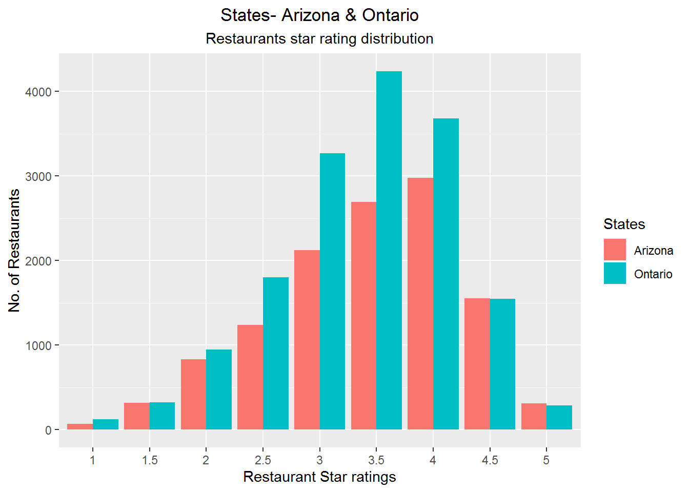
It can be inferred that the state of Ontario has better rated restaurants in comparison to the state of Arizona. Although this could also occur due the fact that Ontario has 4000 more restaurant listings in the dataset.
Average star rating for AZ & ON
sum_az_on <- rbind(az_df,on_df)

sum_az_on <- sum_az_on[c(4,5,9)]

az_on_cities_stars <- sum_az_on %>% group_by(state,city) %>% summarise(avg_star = mean(stars))

bx_plt <- ggplot(az_on_cities_stars, aes(x = state, y = avg_star, fill= state)) +
  geom_boxplot(alpha = 0.7) +
  labs(title = "Average Star Rating of Arizona & Ontario", x= "States", y= "Star Ratings")+
  theme(plot.title = element_text(hjust = 0.5), plot.subtitle = element_text(hjust = 0.5),
        axis.text.x = element_text(size = 11), axis.text.y = element_text(size = 11)) +
  scale_x_discrete(breaks=c("AZ","ON"), labels= c("Arizona", "Ontario")) +
  scale_fill_discrete(name= "State", breaks=c("AZ","ON"), labels= c("Arizona", "Ontario"))

bx_plt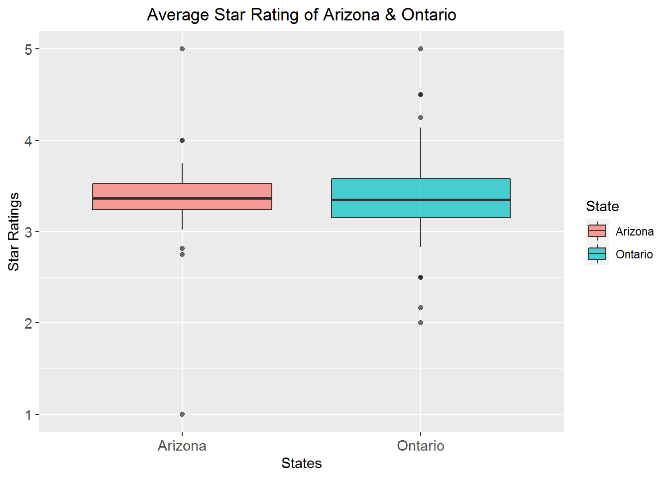
We can observe that state of Arizona has lowest average rated restaurant as 1 star and state of Ontario has lowest average rated as 2 star. And both the states have restaurants with highest average rating of 5 star. Also we can see that the whiskers of Ontario state seems to be indicating that the average rated restaurant is more than that of Arizona.
Arizona Top 5 restaurant types and cities
az_df$Sub_category <- as.factor(az_df$Sub_category)

temp_az_res_type <- as.data.frame(table(az_df$Sub_category))

temp_az_res_type <- temp_az_res_type[order(-temp_az_res_type$Freq),]

temp_az_res_type$Var1 <- as.factor(temp_az_res_type$Var1)

ggplot(data = top_n(temp_az_res_type,5) , aes(x = reorder(Var1, Freq), y = Freq)) +
  geom_bar(stat = 'identity', fill="steelblue") +
  labs(x ="Restaurant Type/Cuisine", y= "Count", title = "Arizona State", subtitle = "Top 5 Restaurant Types" ) +
  theme(plot.title = element_text(hjust = 0.5), plot.subtitle = element_text(hjust = 0.5)) +
  coord_flip()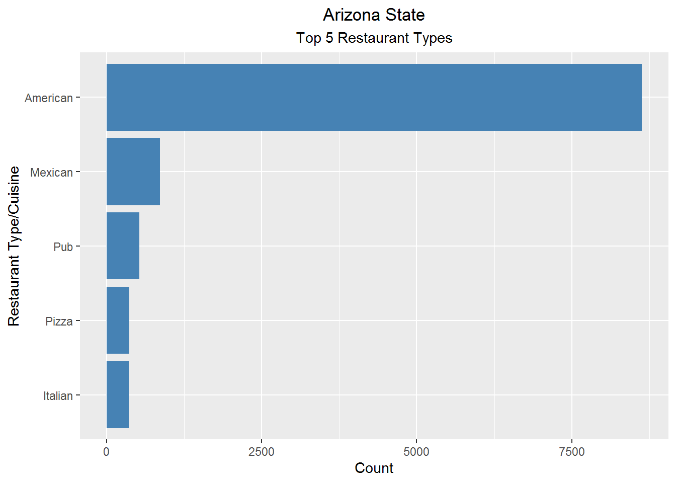
It can be inferred that American cuisine type is well established. Also Mexican cuisine is the second most favoured by the restaurants due to the sharing of border with Mexico.
num_rest_az <- as.data.frame(table(az_df$city))

num_rest_az <- num_rest_az[order(-num_rest_az$Freq),]

ggplot(data = top_n(num_rest_az,5) , aes(x = reorder(Var1, -Freq), y = Freq)) +
  geom_bar(stat = 'identity', fill="tomato3") +
  labs(x ="City Name", y= "No. of Restaurants", title = "Arizona State", subtitle = "Top 5 Cities w.r.t. number of Restaurants" ) +
  theme(plot.title = element_text(hjust = 0.5), plot.subtitle = element_text(hjust = 0.5))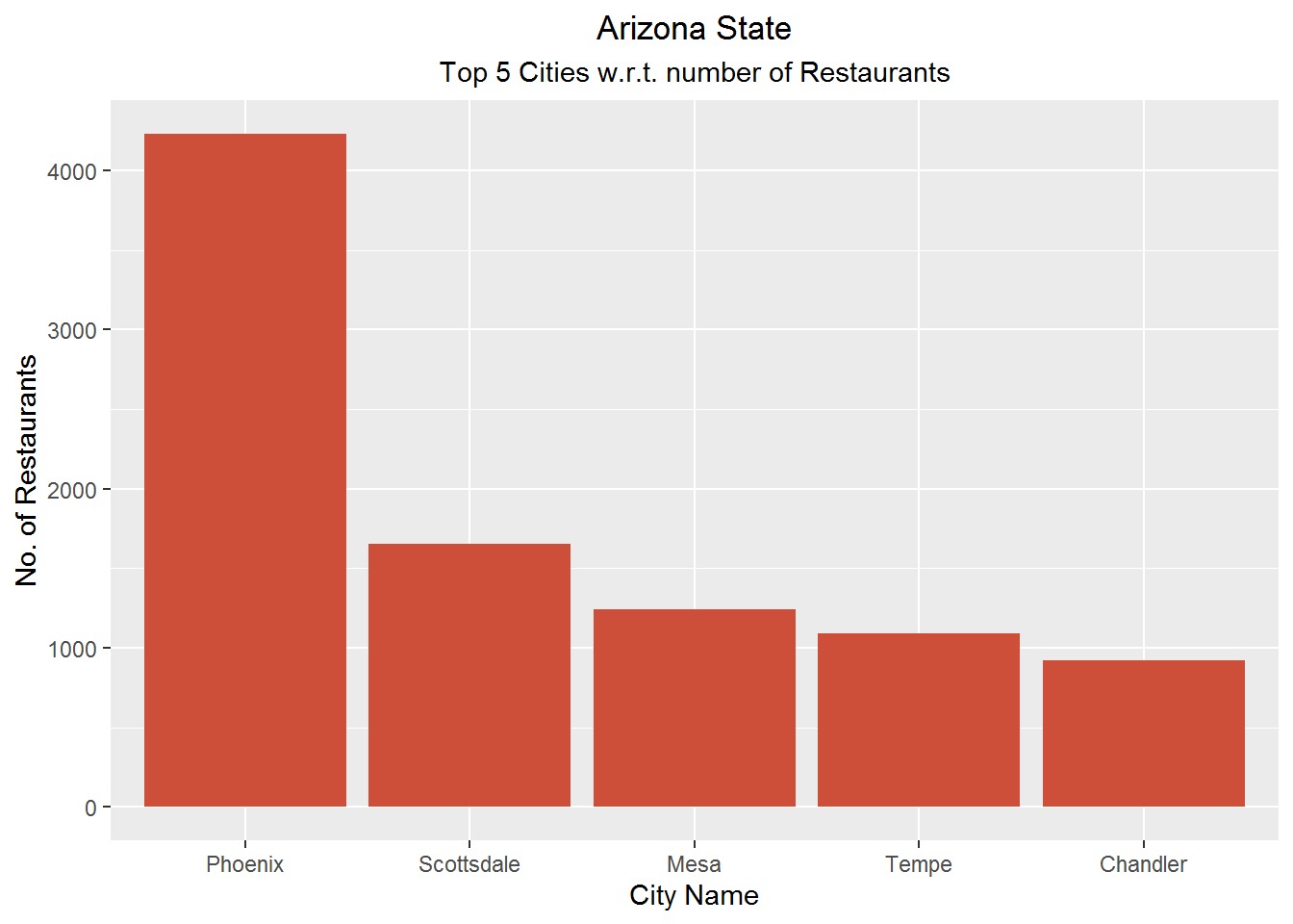
Ontario Top 5 restaurant types and cities
on_df$Sub_category <- as.factor(on_df$Sub_category)

temp_on_res_type <- as.data.frame(table(on_df$Sub_category))

temp_on_res_type <- temp_on_res_type[order(-temp_on_res_type$Freq),]

temp_on_res_type$Var1 <- as.factor(temp_on_res_type$Var1)

ggplot(data = top_n(temp_on_res_type,5) , aes(x = reorder(Var1, Freq), y = Freq)) +
  geom_bar(stat = 'identity', fill="steelblue") +
  labs(x ="Restaurant Type/Cuisine", y= "Count", title = "Ontario State", subtitle = "Top 5 Restaurant Types" ) +
  theme(plot.title = element_text(hjust = 0.5), plot.subtitle = element_text(hjust = 0.5)) +
  coord_flip()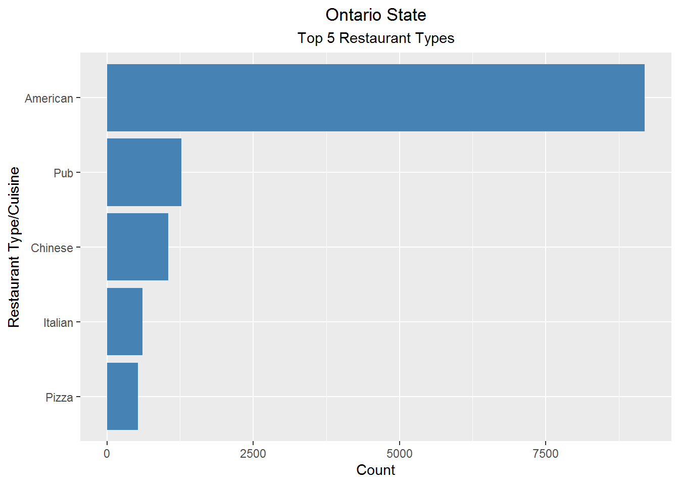
Being in the North American continent, Ontario has highest American cuisine restaurants, followed by Pub; due to Toronto being the hub for business and higher education attracting younger people.
num_rest_on <- as.data.frame(table(on_df$city))

num_rest_on <- num_rest_on[order(-num_rest_on$Freq),]

ggplot(data = top_n(num_rest_on,5) , aes(x = reorder(Var1, -Freq), y = Freq)) +
  geom_bar(stat = 'identity', fill="tomato3") +
  labs(x ="City Name", y= "No. of Restaurants", title = "Ontario State", subtitle = "Top 5 Cities w.r.t. number of Restaurants" ) +
  theme(plot.title = element_text(hjust = 0.5), plot.subtitle = element_text(hjust = 0.5))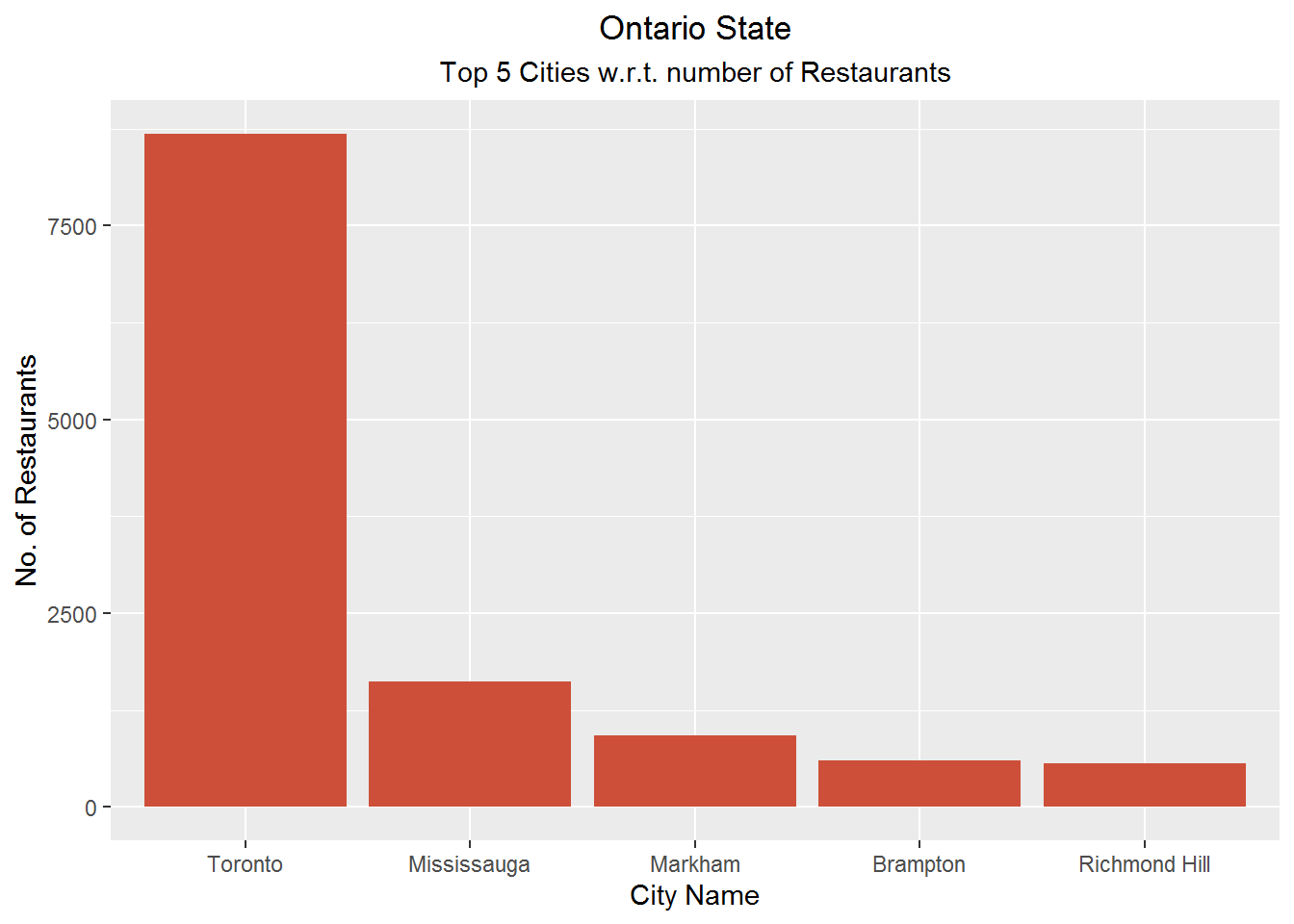
We see that Phoenix and Toronto are cities with highest restaurants for states of Arizona and Ontario respectively. Additionally American is the top restaurant type for them.
Based on the above bar plots, We investigate those cities for price distribution.
City wise price distribution
most_exp_ph <- az_df[az_df[,'city'] == 'Phoenix',]

temp_ph <- as.data.frame(table(most_exp_ph$Price_range))

temp_ph$Var1 <- ifelse(grepl('1', temp_ph$Var1, ignore.case = F), '1',
                       ifelse(grepl('2',temp_ph$Var1, ignore.case = F), '2',
                              ifelse(grepl('3',temp_ph$Var1, ignore.case = F), '2',
                                     ifelse(grepl('4',temp_ph$Var1, ignore.case = F), '4',
                                            'Not Available'))))

temp_ph <- temp_ph %>% group_by(Var1) %>% summarise(sum_price = sum(Freq))

temp_ph$Var1 <- ifelse(grepl('1', temp_ph$Var1, ignore.case = F), 'Under $10',
                       ifelse(grepl('2',temp_ph$Var1, ignore.case = F), '$11-60',
                              ifelse(grepl('4',temp_ph$Var1, ignore.case = F), 'Above $60',
                                     'Not Available')))

most_exp_tn <- on_df[on_df[,'city'] == 'Toronto',]

most_exp_tn$Price_range <- as.factor(most_exp_tn$Price_range)

temp_tn <- as.data.frame(table(most_exp_tn$Price_range))

temp_tn$Var1 <- ifelse(grepl('1', temp_tn$Var1, ignore.case = F), '1',
                       ifelse(grepl('2',temp_tn$Var1, ignore.case = F), '2',
                              ifelse(grepl('3',temp_tn$Var1, ignore.case = F), '2',
                                     ifelse(grepl('4',temp_tn$Var1, ignore.case = F), '4',
                                            'Not Available'))))

temp_tn <- temp_tn %>% group_by(Var1) %>% summarise(sum_price = sum(Freq))

temp_tn$Var1 <- ifelse(grepl('1', temp_tn$Var1, ignore.case = F), 'Under $10',
                       ifelse(grepl('2',temp_tn$Var1, ignore.case = F), '$11-60',
                              ifelse(grepl('4',temp_tn$Var1, ignore.case = F), 'Above $60',
                                     'Not Available')))

### Plotting the pie charts side-by-side ###
fig_pie <- plot_ly()

fig_pie <- fig_pie %>% add_pie(data = temp_ph, labels = ~Var1, values = ~sum_price, name = 'Phoenix \nRestaurant',
                               domain = list(row = 1, column = 0))

fig_pie <- fig_pie %>% add_pie(data = temp_tn, labels = ~Var1, values = ~sum_price, name = 'Toronto \nRestaurant',
                               domain = list(row = 1, column = 1))

fig_pie <- fig_pie %>% layout(title = "Phoenix & Toronto City - Restaurant Price/Person Distribution",
                              showlegend = T,
                              legend=list(title=list(text='<b> Price per Person </b>')),
                              grid=list(rows=1, columns=2),
                              xaxis = list(showgrid = FALSE, zeroline = FALSE, showticklabels = FALSE),
                              yaxis = list(showgrid = FALSE, zeroline = FALSE, showticklabels = FALSE),
                              annotations = list(
                                list(x = 0.2 , y = 0.85, text = "<b>Phoenix</b>", showarrow = F, xref='paper', yref='paper'),
                                list(x = 0.8 , y = 0.85, text = "<b>Toronto</b>", showarrow = F, xref='paper', yref='paper')
                              ))
fig_pie
When comparing the top two cities of these states, we found that city of Toronto has more number of restaurants for the price range of ‘$11-60’ than the city of Phoenix. It can also indicate that Toronto city has population of higher income group.